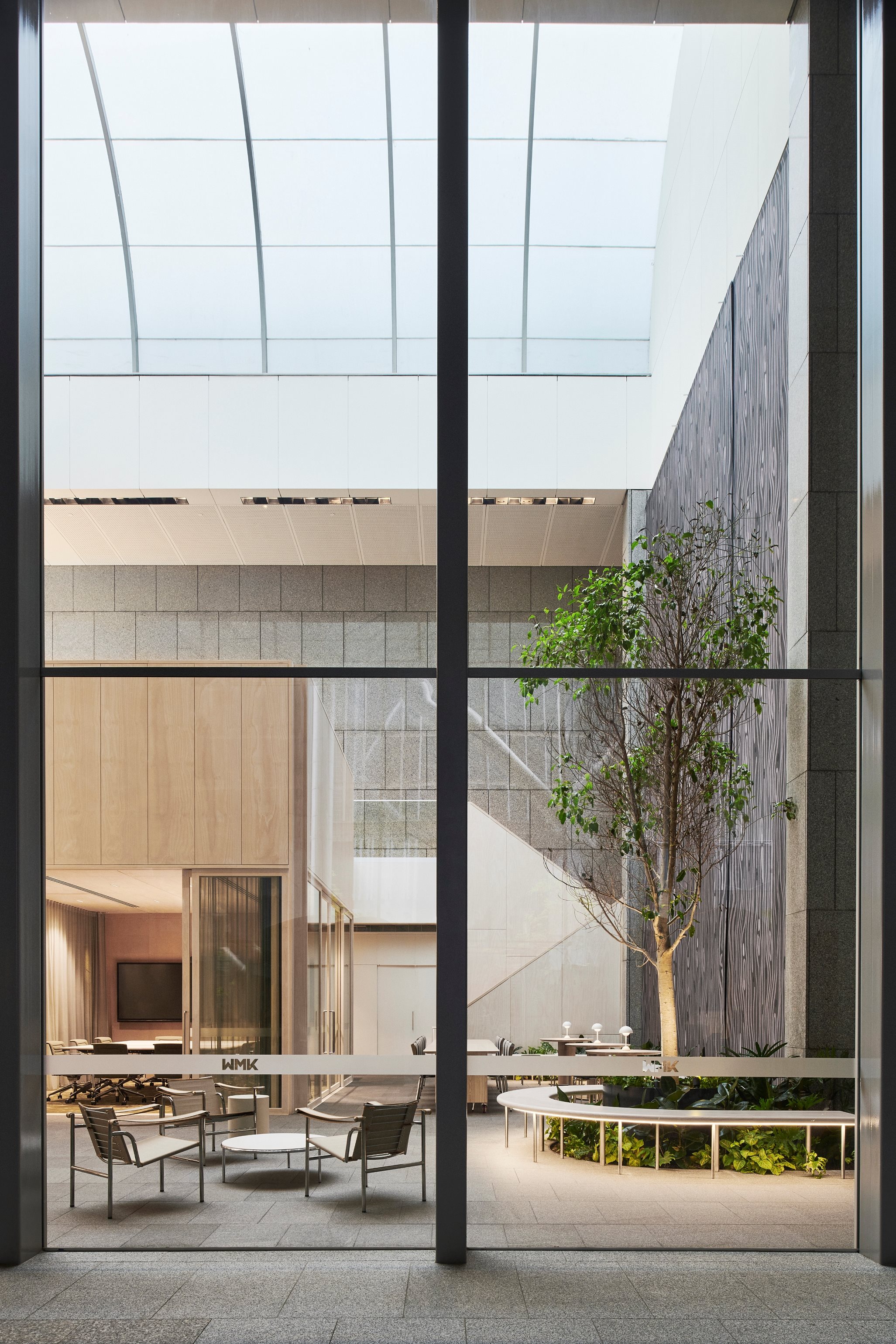
WMK's new Sydney studio is situated under the iconic commercial office tower at 9 Castlereagh St, originally designed by Harry Seidler. The 12 metre high skylit space, commonly known as the atrium and once utilised as a childcare centre and restaurant, sits at the end of the entry axis from the forecourt and foyer.
Conscious of preserving the original vision of the space, we strategically designed the studio to reflect our brand identity without compromising the architectural integrity. The workspace was to accommodate a headcount of 80 with the ability to expand and provide flexible workspaces for those that drop in from our interstate offices. Given the limited space with only a small mezzanine floor and no existing services, we extended the mezzanine, incorporating voids to introduce natural light to the ground floor and enhance visual connectivity between the two levels.
To accommodate functional needs of the studio, new bathrooms, a library and versatile meeting spaces of various capacities were introduced across both levels. Our design approach prioritised the creation of collaborative workplace zones throughout the studio, recognising it as the heartbeat of our daily activities. Encouraging active learning and effective decision-making among teams, these zones serve as dynamic environments that foster creativity and productivity.

Behind the 12 metre high glazing in the office foyer, our 'Yarn' space serves as the front of house - a landscaped grand room with a reception, flexible design lab and staff breakout area. Designed to encourage spontaneous interactions, it facilitates conversations and gatherings between staff and visitors.
The ground floor Design Lab and breakout lounge resembles an elegantly designed timber box, a captivating structure visible from the Castlereagh St forecourt. To enhance the existing space, we commissioned a large indigenous artwork that featured a pattern repeat, to cover the unused high waterfall pebblecrete surface. Mindful of the polished granite walls and a seraphic glass barrel vault in the foyer, our design incorporates light timber with warm tones, offering a harmonious contrast to the existing grey salt and pepper granite. The flooring and furniture subtly feature muted greens, aligning with WMK's brand colors.
With sustainability at the forefront of the design, materials such as Cork have been used as an acoustic wall lining, pin up surface and textural feature, chosen due to its renewable, sustainable and biodegradable nature. FSC certified timber has also been used throughout the fit out as a solid timber partition system as well as decorative panels. The Custom Concierge Desk in the arrival area was made from recycled building materials and samples and the Terrazzo floor and wall tiles for the bathrooms were made from recycled materials for the aggregates. Furniture selection was crucial to avoid short-lived style trends and instead we opted for timeless, high-quality pieces whose suppliers have refurbishment and recycling schemes aligning with our values.

The transformation of the space has played a pivotal role in redefining and elevating the overall look and feel of the ground floor plane.
Creating a genuine "wow” factor upon entering the space, the design exudes an uplifting yet relaxing energy. This distinctive atmosphere, not typically congruent with traditional workspaces, resonates more with a welcoming hospitality venue. The deliberate design and meticulous planning that define the space showcases WMK’s commitment to breaking away from the ordinary to deliver a unique brand experience.
Passersby are frequently captivated by the inviting aura - this speaks volumes about the space's unique charm, making it stand out as an inviting and refreshing departure from conventional office environments. The carefully curated design elements not only foster productivity but also create an environment where work seamlessly intertwines with a sense of comfort and hospitality.

